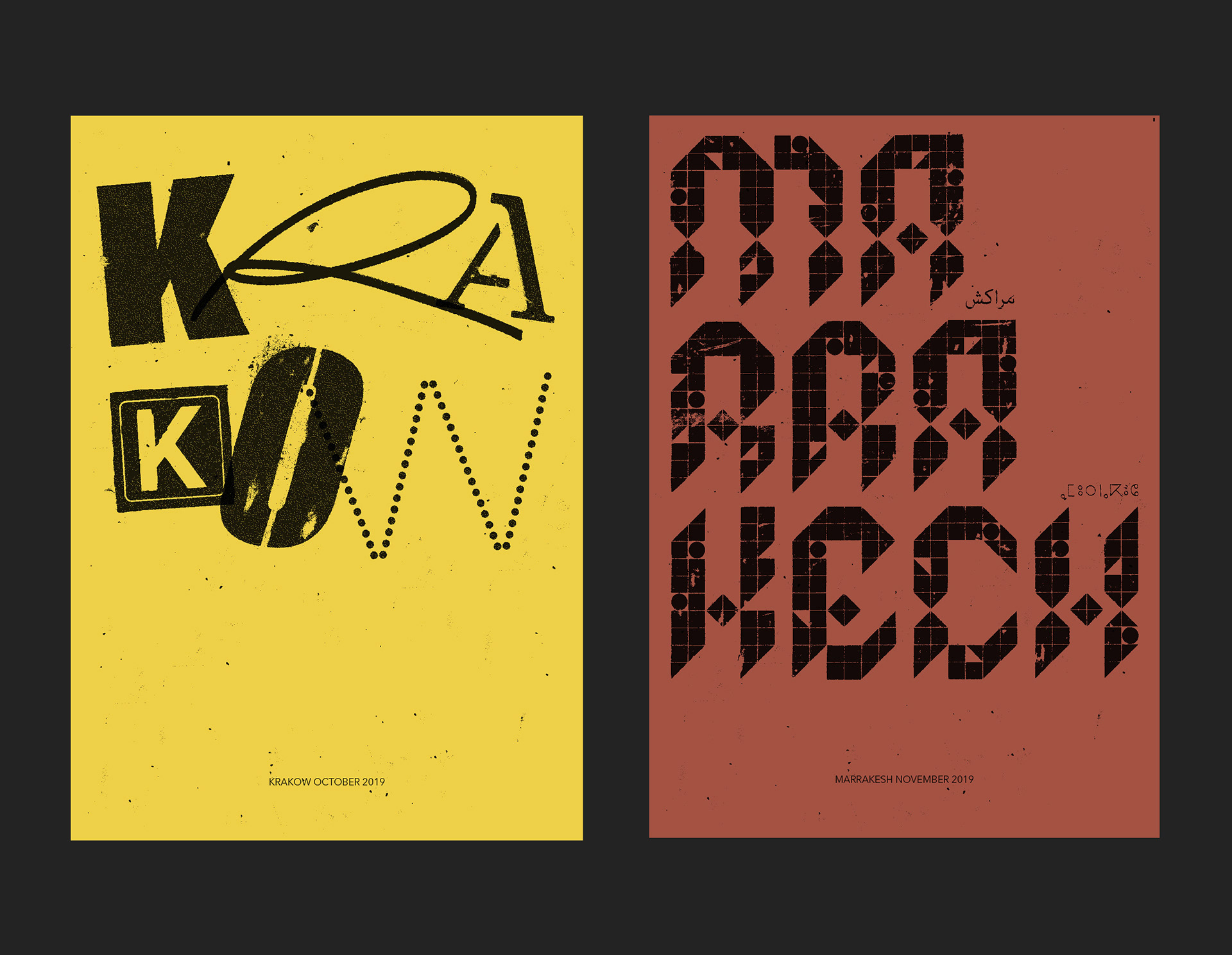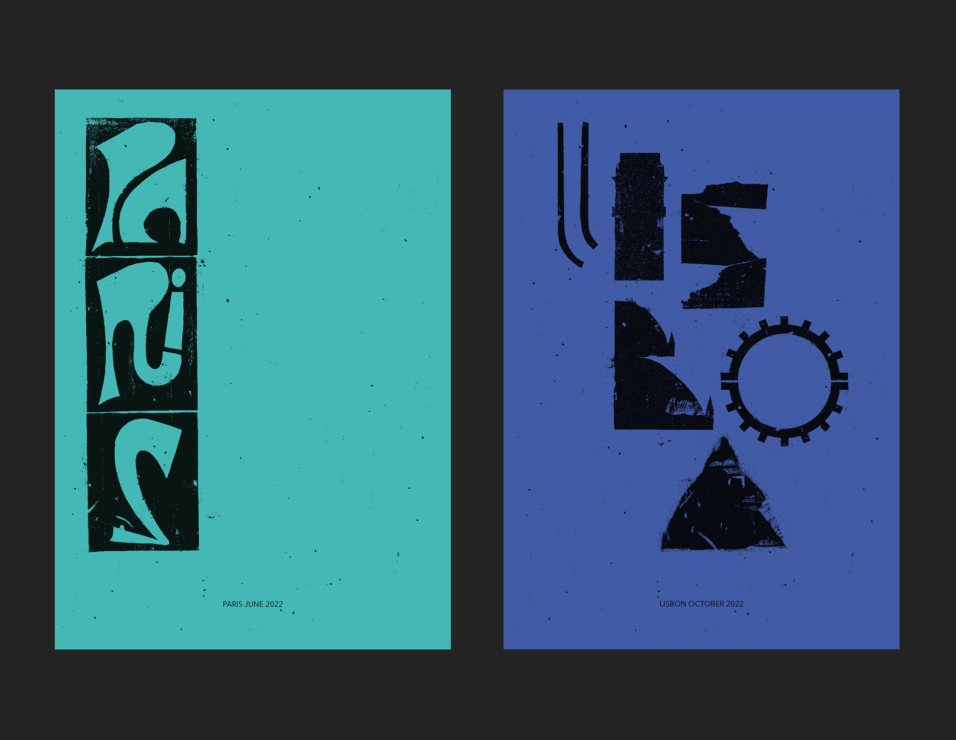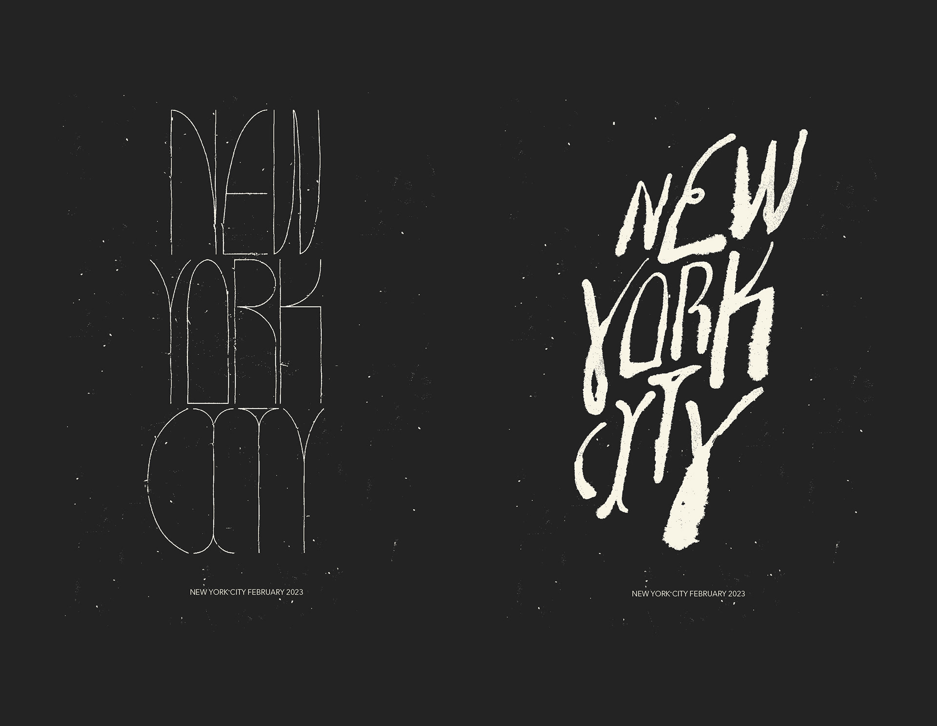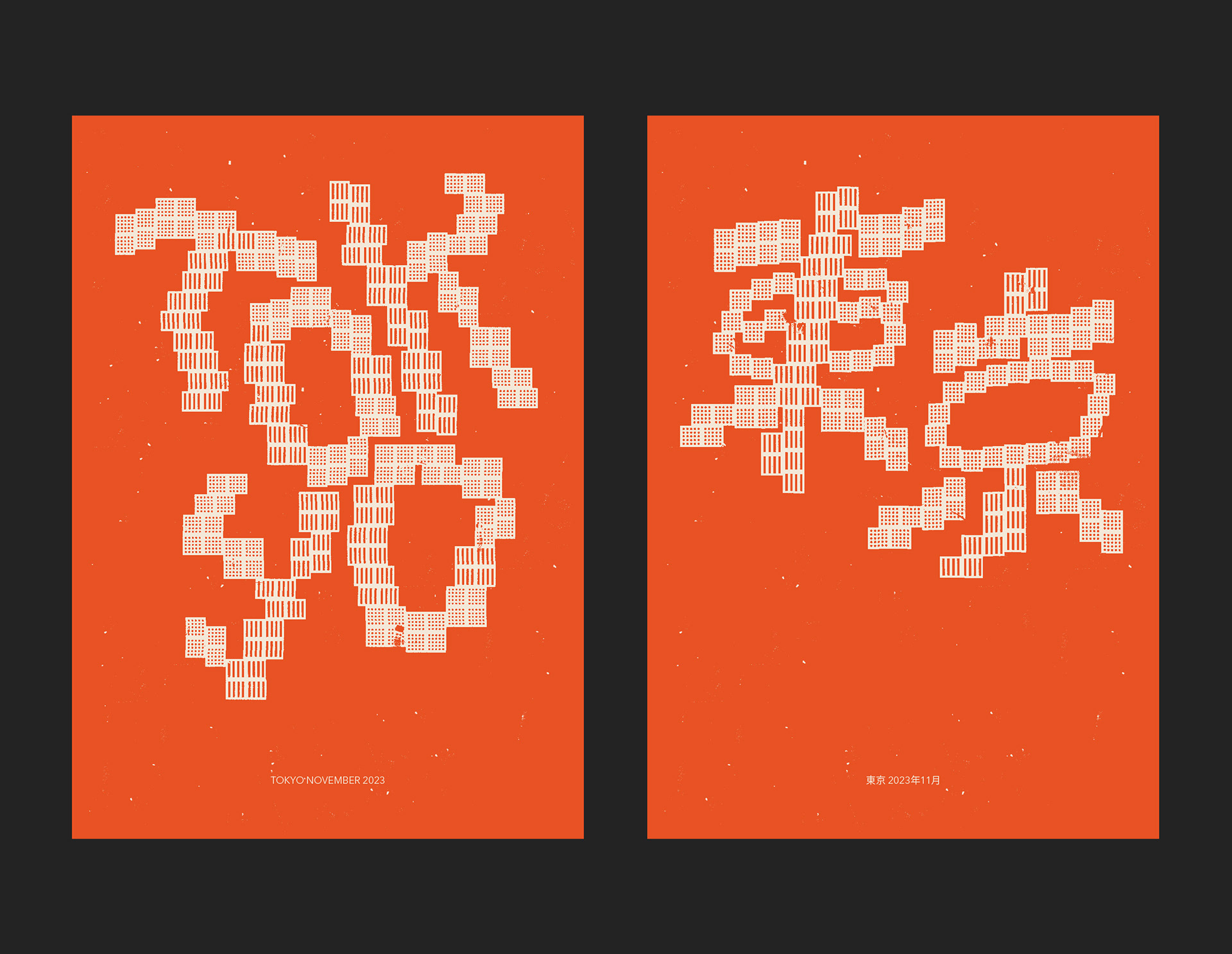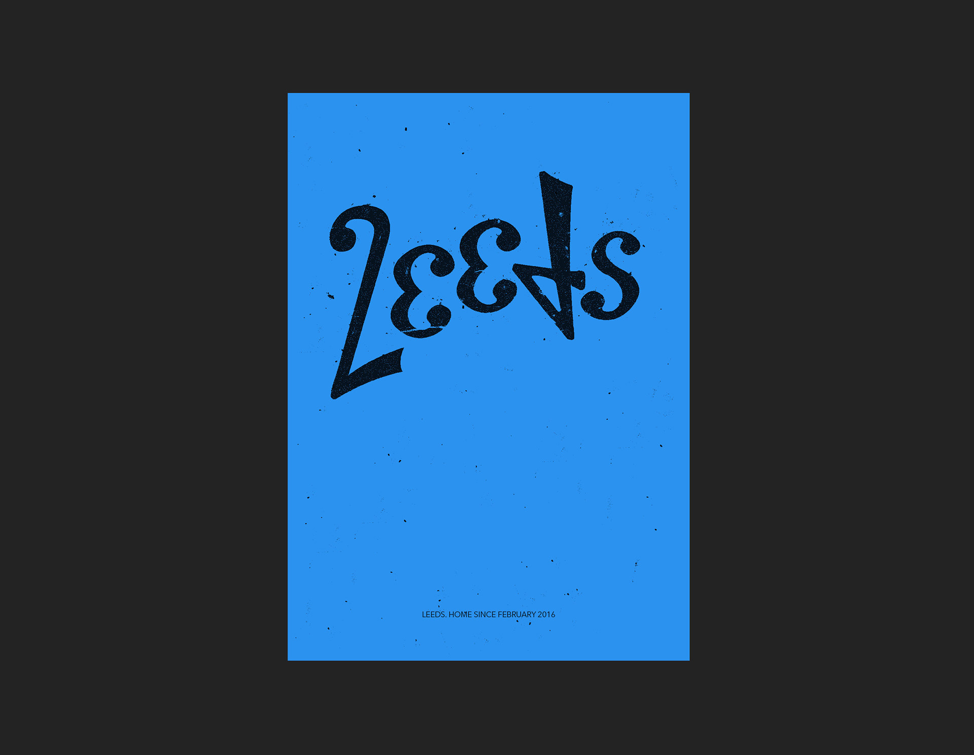
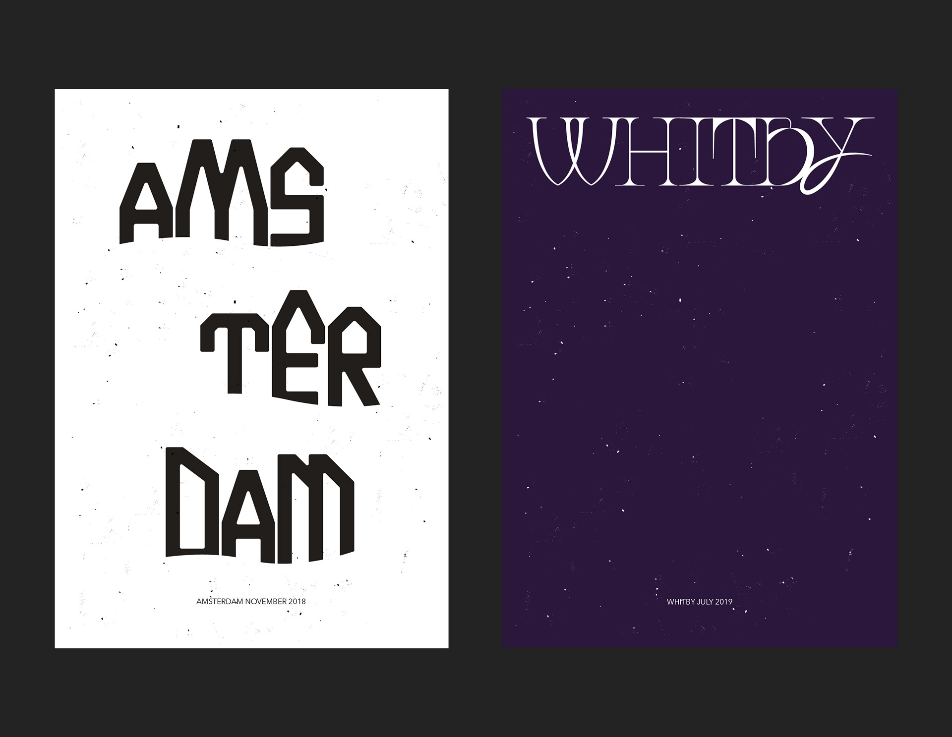
These posters are part of a series where I create a poster of a city after visiting. I come up with a simple idea based on something I’ve seen or experienced in each place and create custom typography based on it. For example the Krakow lettering was based on the metal covers of the gas controls on the outside of many buildings. Tokyo was based on the vision impaired assistance tiles on the ground all over the city. The shapes of the New York letters were inspired by the art deco architecture but grunged up by hand with ink to represent the gritty city.