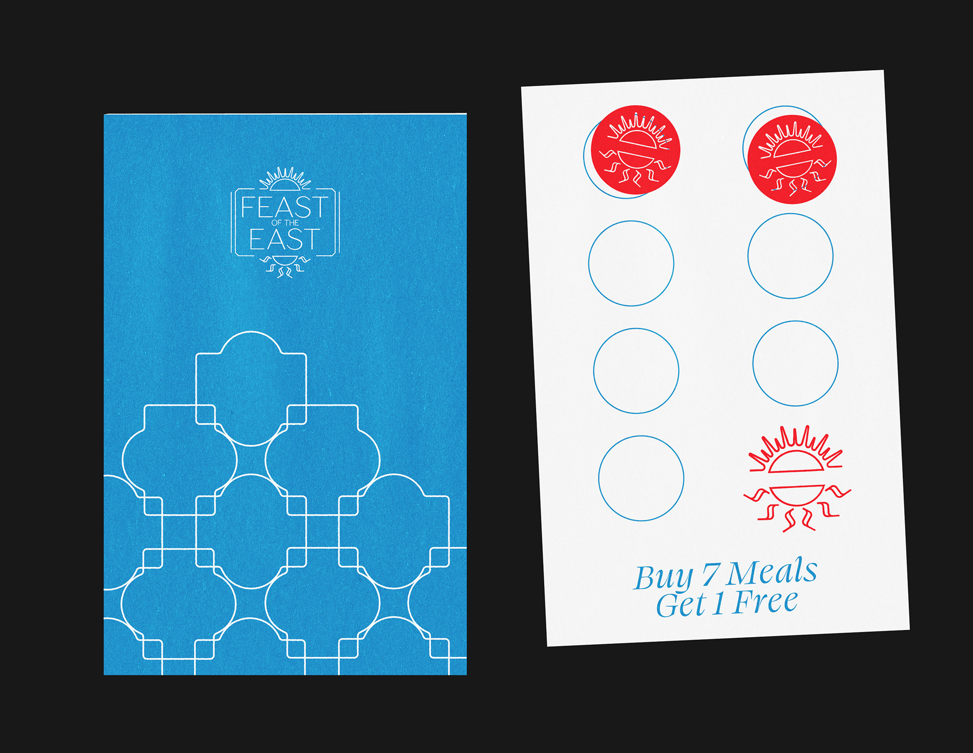
Feast of the East are slowly making a name for themselves in the Midlands food scene, serving delicious street food with a Mediterranean and Middle East twist. They came to us for a new simple brand to help them stand out next to competitors and reflect their new popularity.
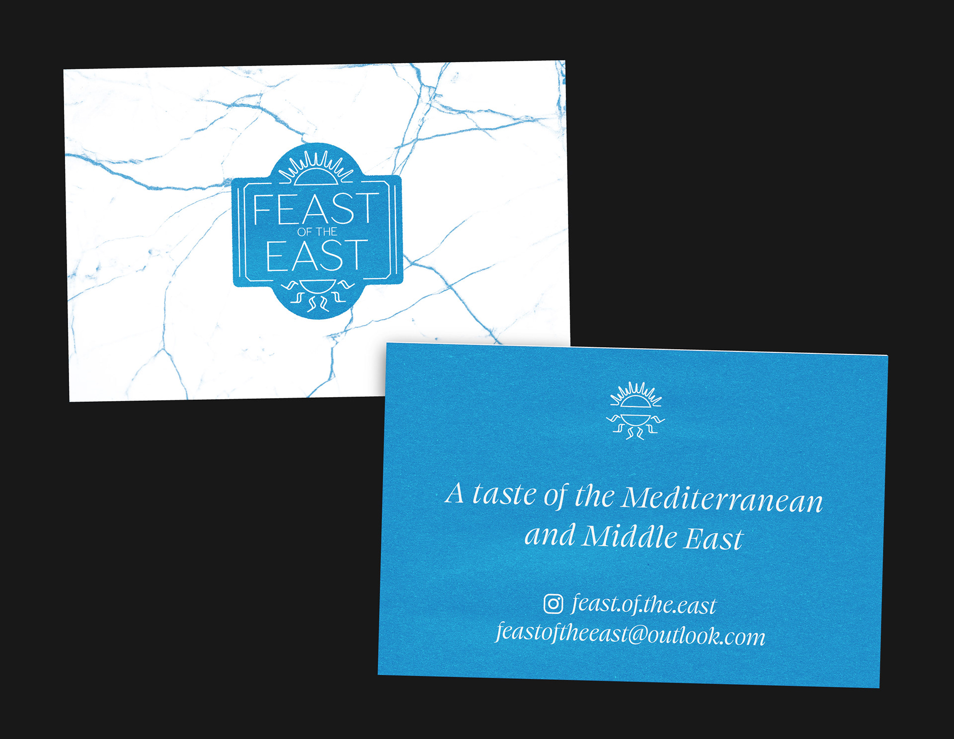
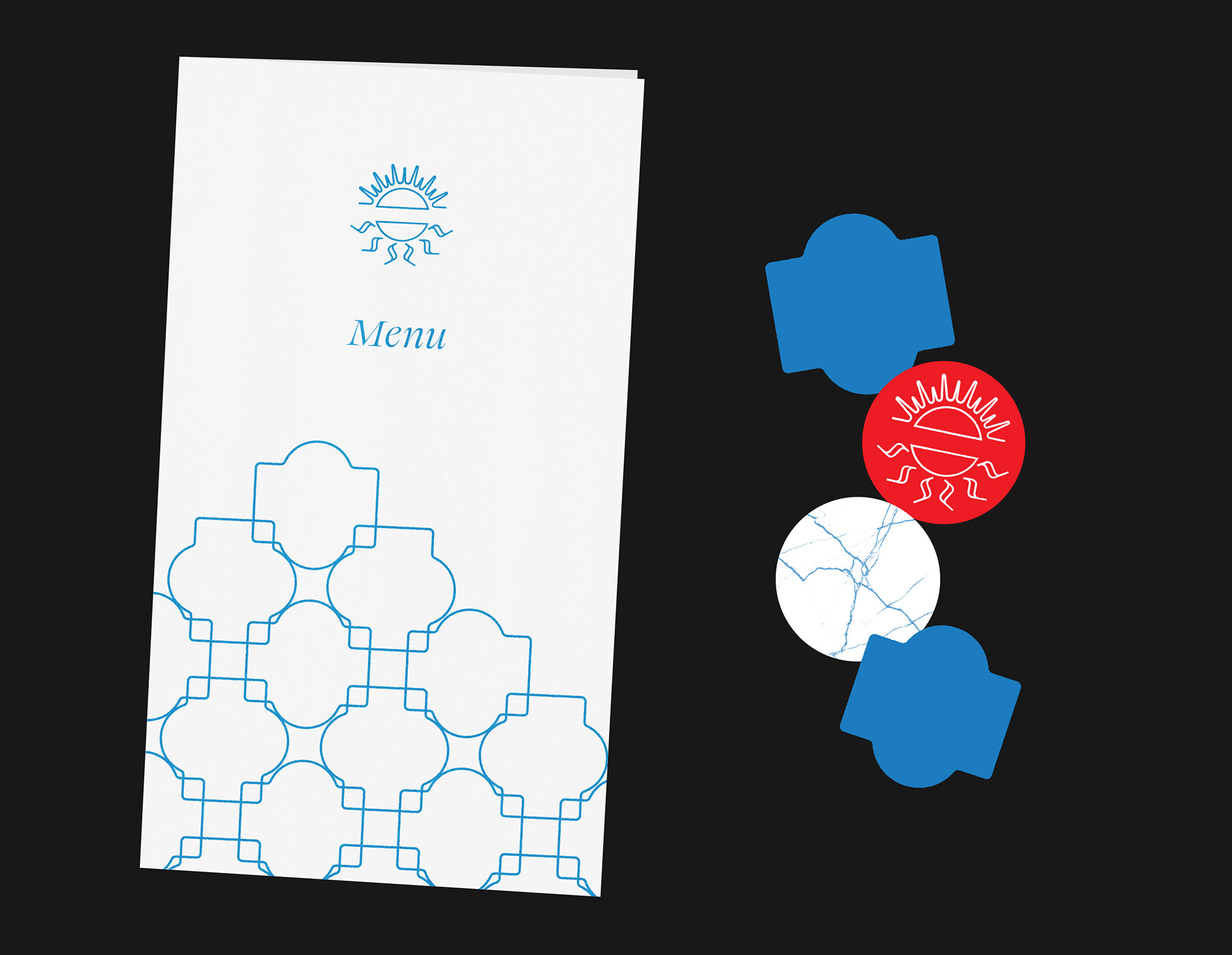
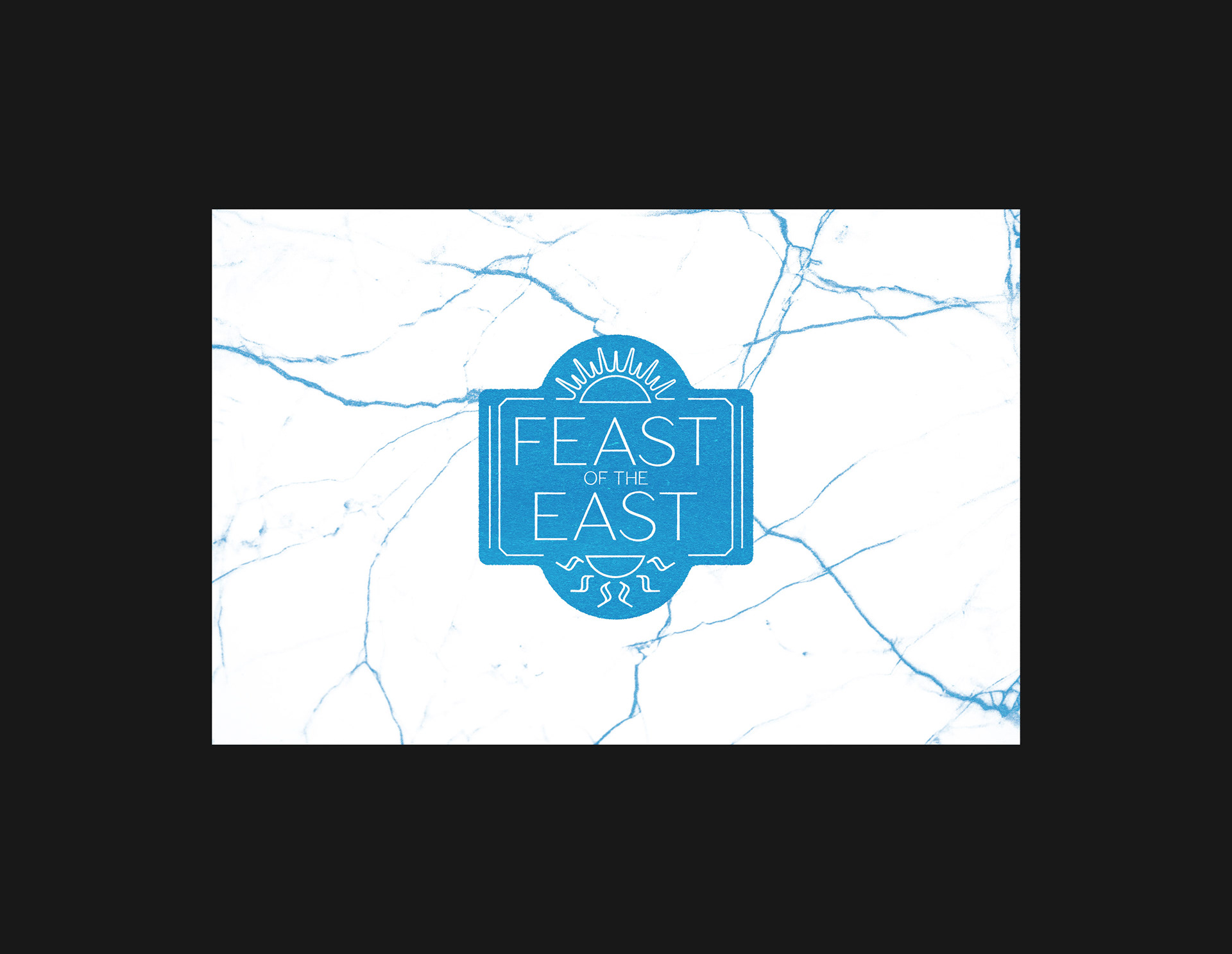
The logo symbol references a mix of Med and Mid East decorative tiles with a 2 suns graphic showing the sun rising in the east. The light weighted typography blends seamlessly with the tile decoration and the subtle texture hints at the weathering of ancient art and artefacts found in the area. The single colour used is the blue of the Mediterranean sea.